This was quite a project for a healthcare copywriter like me!
 A former client contacted me to write and manage this 66-page website for a plastic and cosmetic surgeon on the San Francisco peninsula.
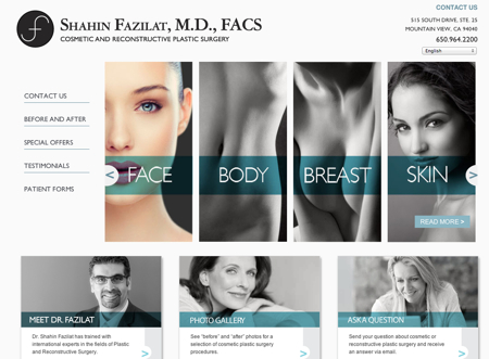
As you can see from the “Before” site above, the original home page was very well designed, but way too busy. They didn’t need a list of every single service that they offered on that page. While it featured a pretty photo, the old home page didn’t tell their whole story.
The result is SF Bay Area Plastic Surgery, which now features five home page sliders to showcase what they do, where they do it, one of their specialties (Mommy Makeovers), their tagline (“The Perfect Solution to a New You”), and their results.
Now, as you can see in the “After” screen shot below of the revised site that I wrote, what I especially love about this site is the way that the color changes on most pages. For example, on the home page, you first see black-and-white images of Face, Body, Breast and Skin, as well as Meet Dr. Fazilat, Photo Gallery and Ask A Questions. But when you mouse over them, they subtly change to color. I’d never see that before and I’ve written over 175 sites to date. (NOTE: This site has since been redesigned)
 This gorgeous website was a creative collaboration by the following very talented folks:
• Candace Upman and her terrific team at Mitchell Design of Palo Alto, CA, who designed the layouts for most of the pages on the site.
• Bradley Charbonneau of Likoma, an eight-year collaboration partner, who took the customized designs and make them work with WordPress’s Woo Canvas template.
• Pam Card of Surefire Online Marketing, who fed me the SEO keywords for most of the key pages on the site.
• Rachel Melia, an online marketing consultant with whom I’d worked in the past –– and an Amazon author!
• And Dr. Shahin Fazilat, a renowned cosmetic and reconstructive plastic surgeon in Mountain View, CA, who is nationally trained, locally trusted, and Board Certified by the American Board of Plastic Surgery.
This website is also seeded with keywords for the majority of the pages among the detailed descriptions of the procedures, so that people searching for a plastic surgeon in the San Francisco Bay Area can find the site through search engines.
I’m proud to share this testimonial: “Working with Gil has been an absolute joy. He’s a wonderful writer, always on top of deadlines and willing to go the extra mile. But best of all… he’s a great guy with a fabulous sense of humor which is such a plus on any project.” – Candace Upman | Mitchell Design

[…] Below are a few examples of our Power Team’s creative collaboration: 1) Plastic Surgery Website — Web Design, Copywriting and SEO Keywords […]